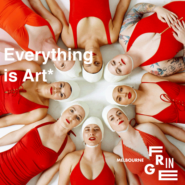
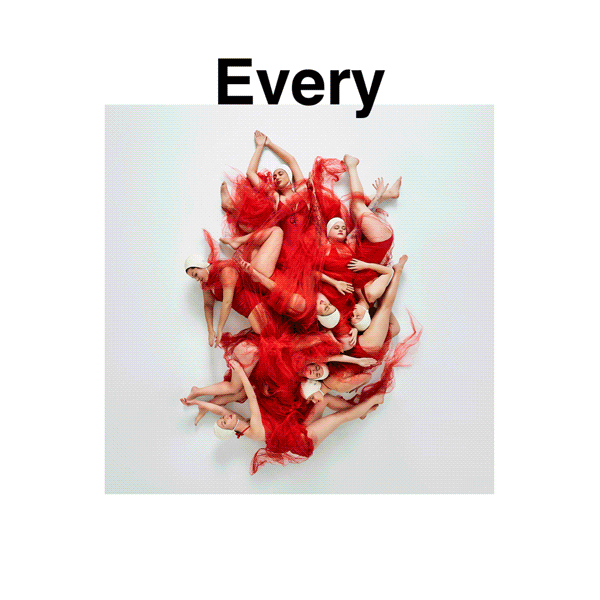
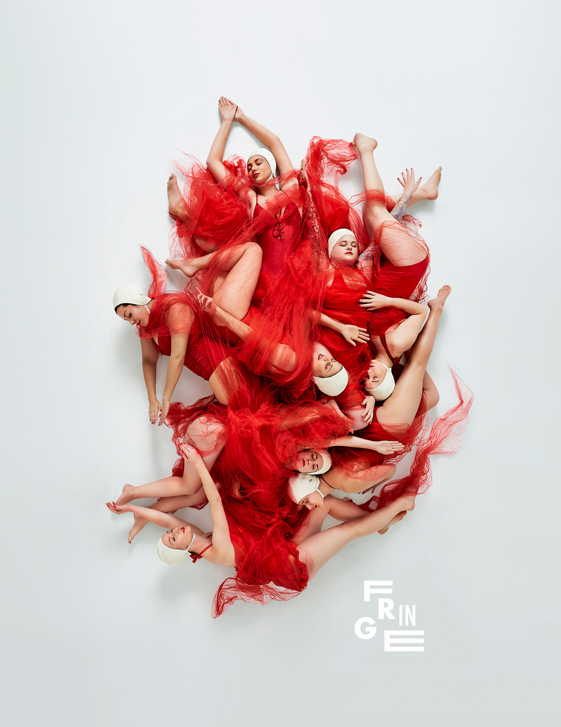
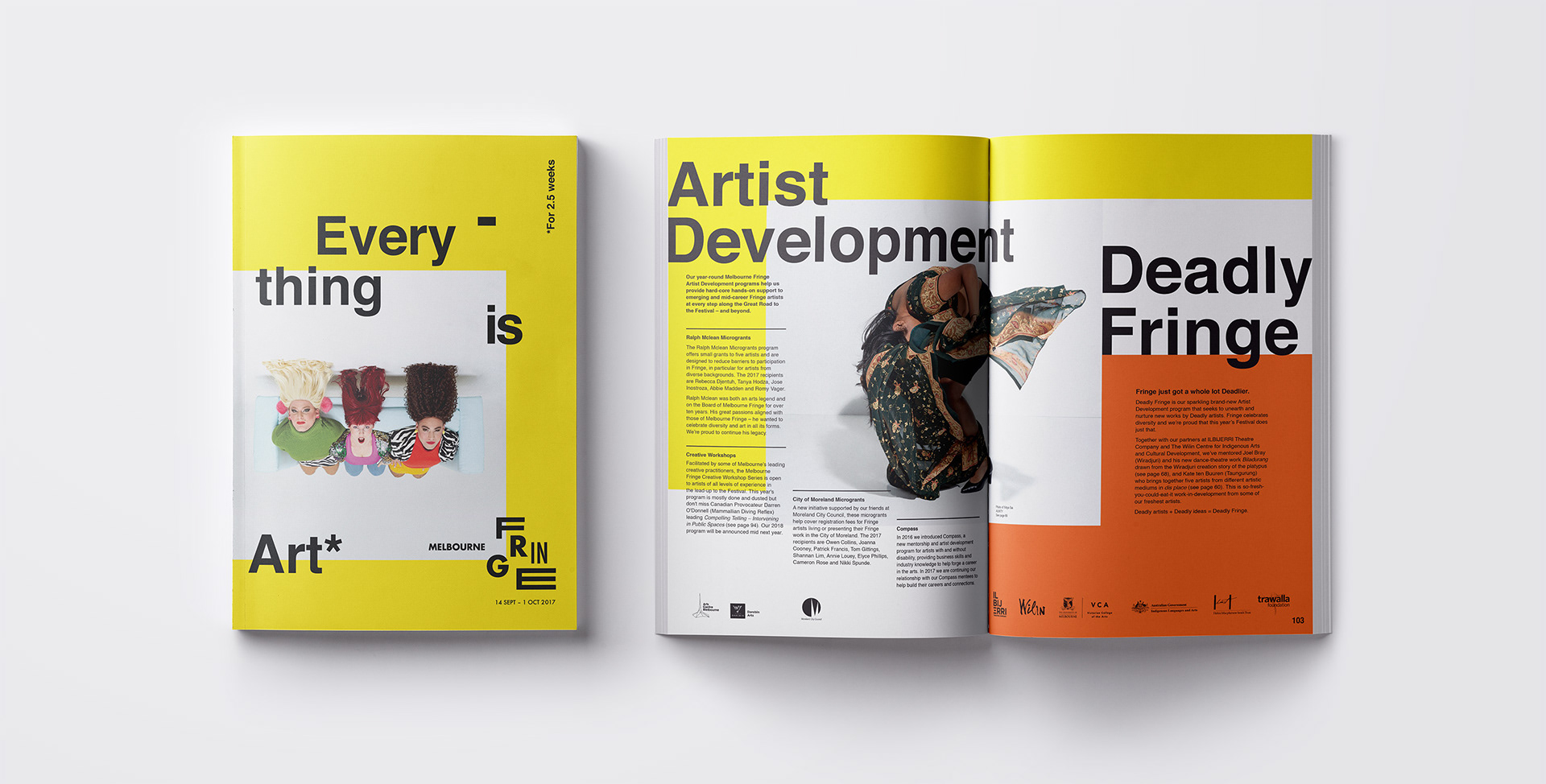
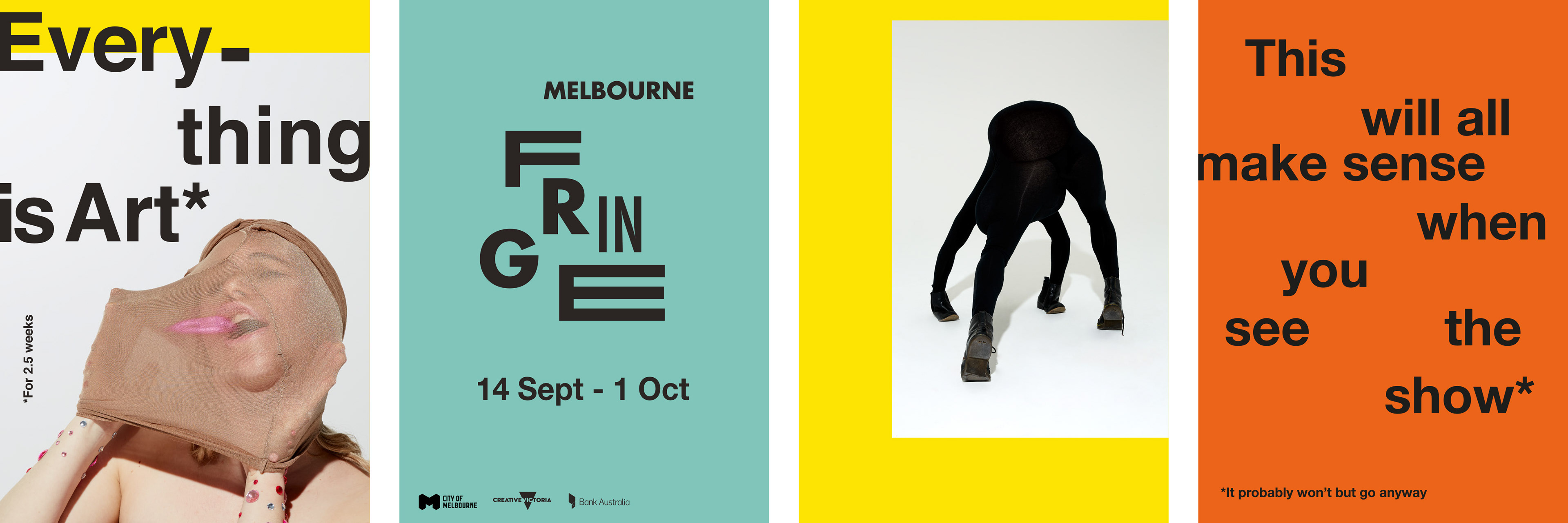
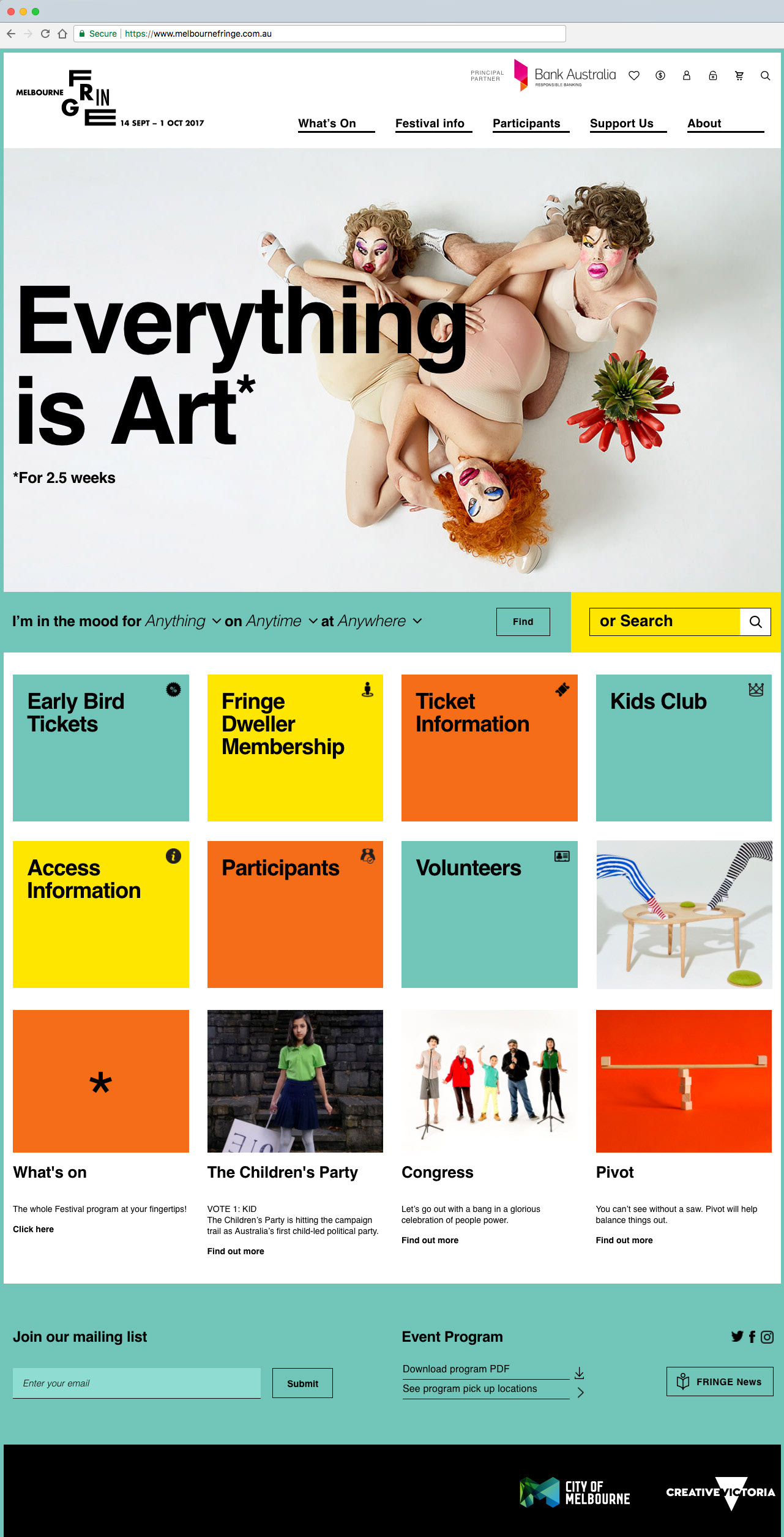
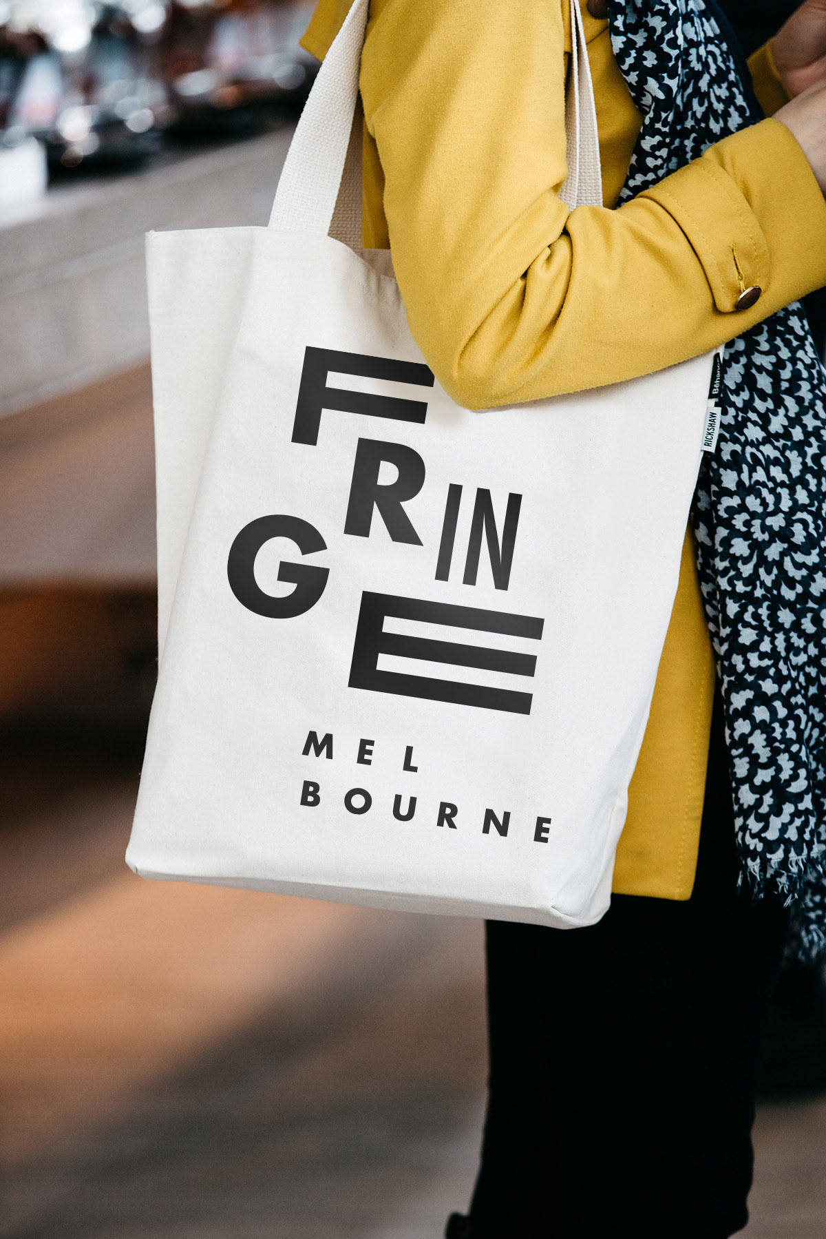
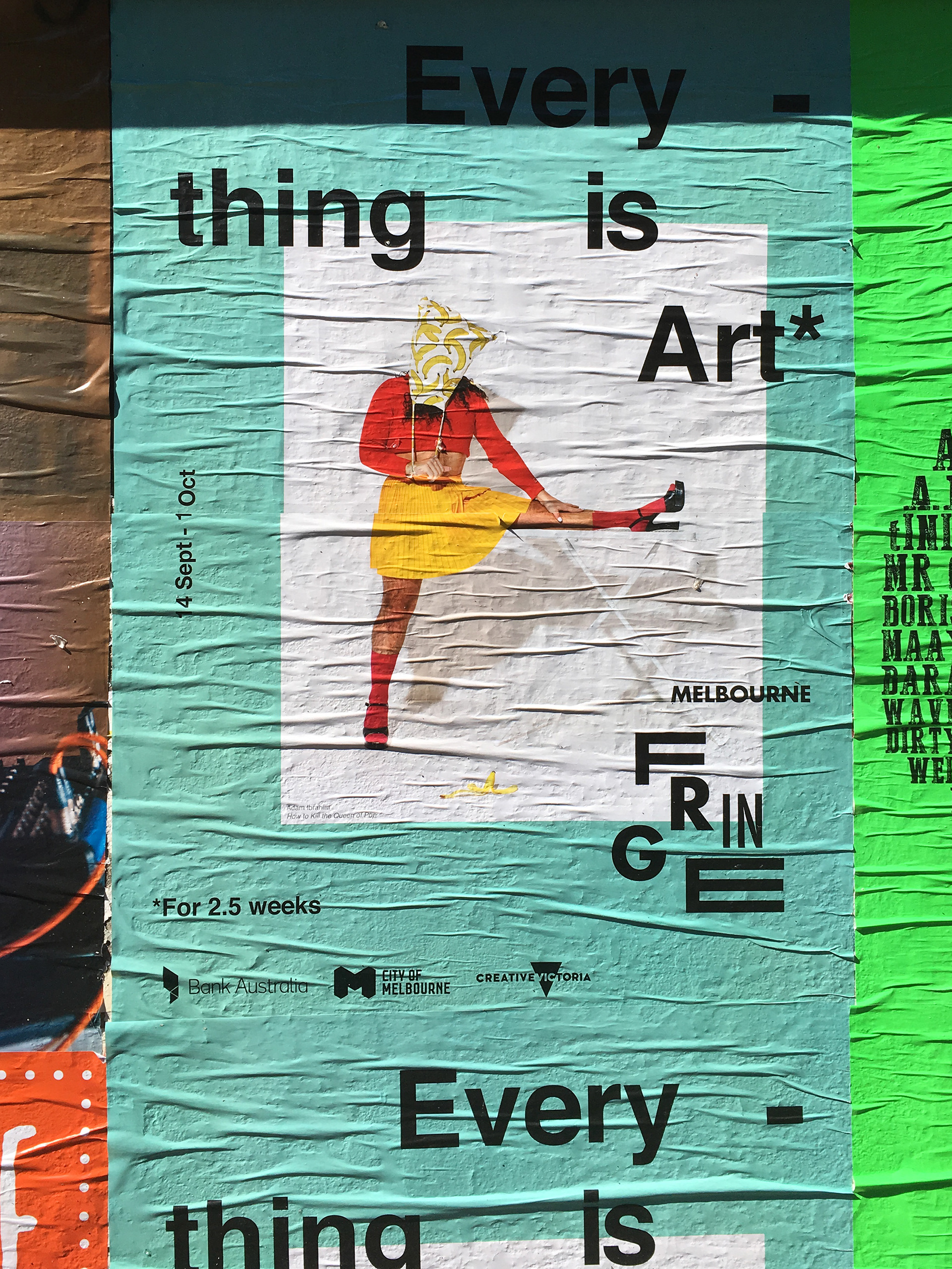
The Melbourne Fringe Festival had been re-inventing the wheel every year with its comms theme and design language, making it feel ad hoc and disparate. We created a new brand platform and visual identity Melbourne Fringe could refresh year on year.
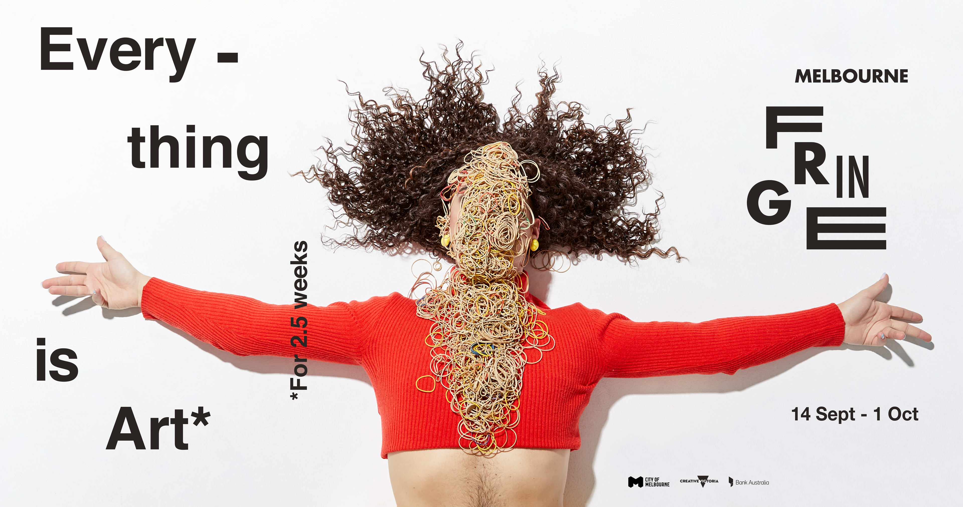
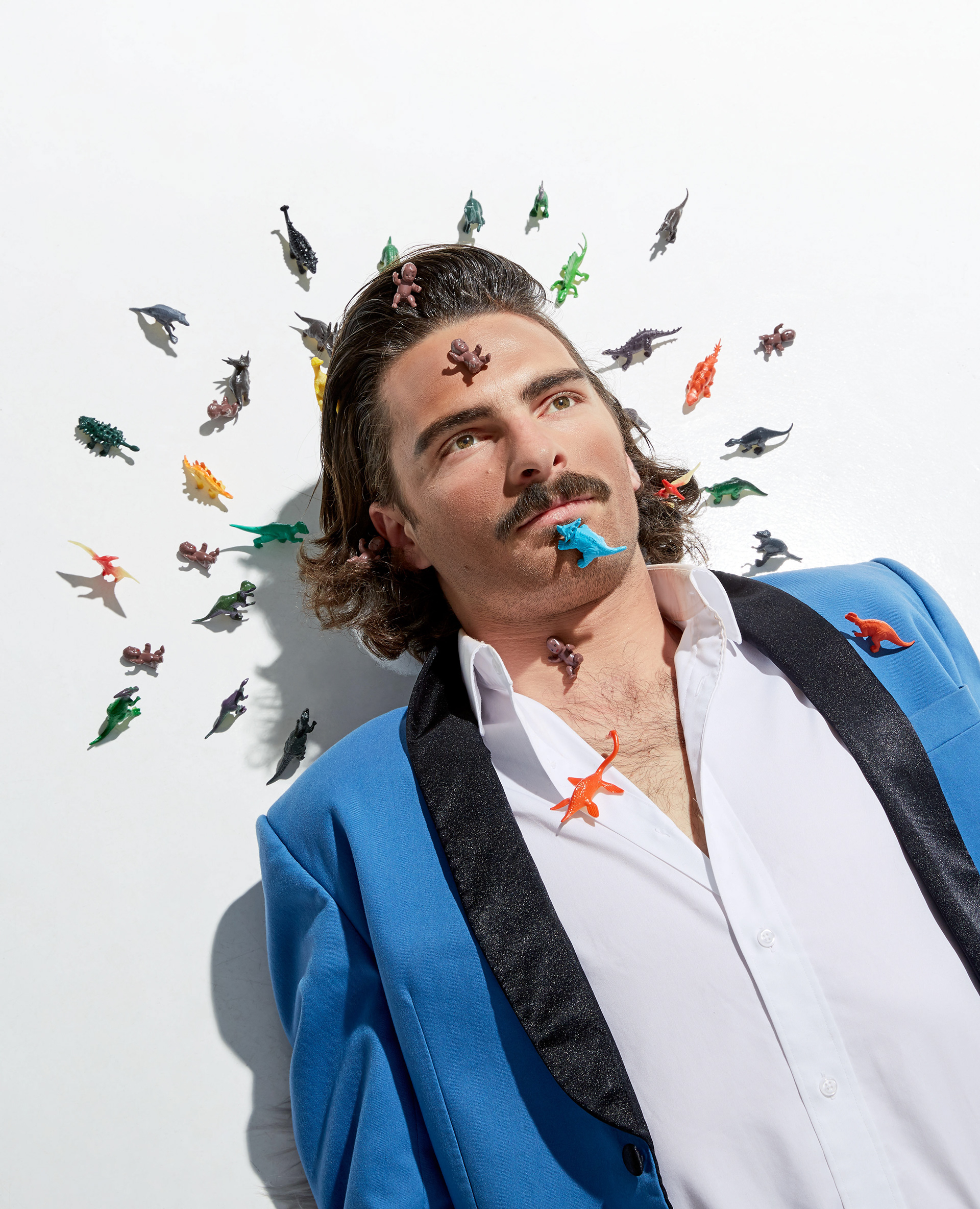
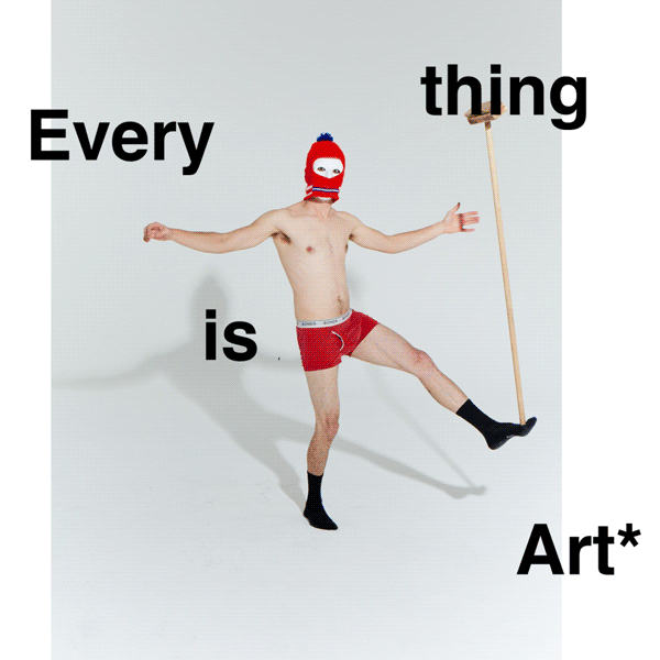
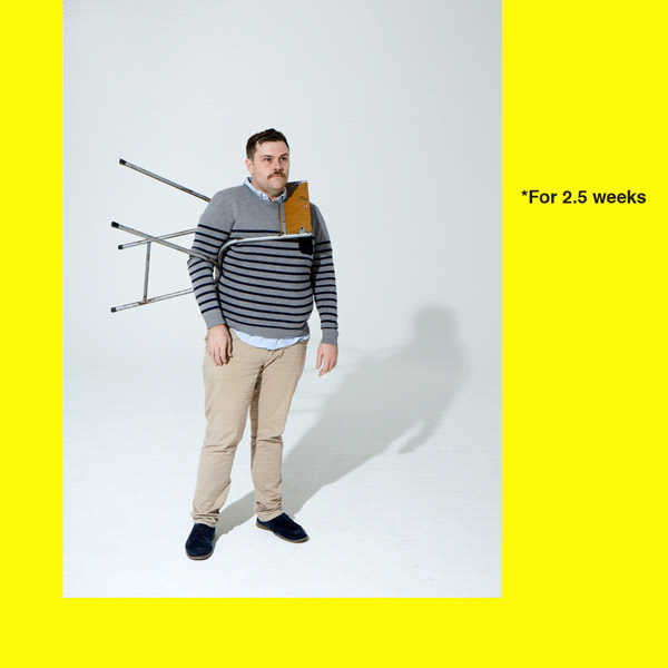
When we saw how diverse the Fringe program was - with shows in hotel rooms, cars, people's homes - we wanted to bring the spirit of this kooky, exuberant 'great art takeover' to life. Our rebrand was born, with fluid, stretchy type; bold design language; and the comms platform, 'Everything is Art *for 2.5 weeks' starring Fringe performers. It happily picked up a D&AD pencil.